
HarvestGroup360
© 2026 HarvestGroup360 — a brand operated by AMII LTD.
The tear sheet reports a maximum drawdown of 20.9 per cent. It does not report that the strategy spent 92.94 per cent of five years below a previous high, that one stretch ran 281 trading days without a new one, or that the same returns produce a 29.8 per cent decline if you watch for ten years instead of five.
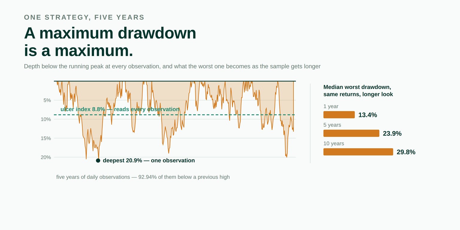
Drawdown is the one risk number everybody reads. It survives in conversations where the Sharpe ratio does not, because it is concrete: this is how much you would have been down at the worst moment. It appears on every tear sheet as a single figure.
That figure is the worst single observation in a sample. Which makes it an order statistic, and order statistics behave in a way that nobody reporting one seems to price in.
Draw ten numbers from a distribution and note the largest. Draw a hundred from the same distribution and the largest will usually be bigger. Nothing about the distribution changed; you simply gave it more chances.
A maximum drawdown works the same way. Run an unchanged strategy for ten years instead of two and its worst decline gets deeper, because there were more opportunities for a bad run to happen. The risk did not rise. The observation window did.
We measured it rather than asserting it. Take one fixed set of daily returns, resample them into paths of different lengths, and record the worst decline in each:
| Horizon | Median worst drawdown | 90th percentile |
|---|---|---|
| 1 year (252 days) | 13.44% | 21.66% |
| 3 years (756 days) | 20.27% | 31.75% |
| 5 years (1,260 days) | 23.92% | 37.32% |
| 10 years (2,520 days) | 29.82% | 42.71% |
Depth and duration are different questions, and only one of them is usually asked. A book down eight per cent for three weeks and a book down eight per cent for three years report an identical drawdown.
Here is the same five-year strategy, measured both ways:
| Quantity | Value | |
|---|---|---|
| Annualised Sharpe ratio | 0.7068 | a respectable strategy |
| Deepest drawdown | 20.8839% | the number on the tear sheet |
| Ulcer index | 8.8358% | root mean square depth, every observation |
| Pain index | 7.1522% | mean depth |
| Ulcer over deepest | 0.4231 | the maximum was an excursion, not a state |
| Observations below a prior high | 1,172 of 1,261 | 92.94% |
| Longest unbroken stretch | 281 days | more than a calendar year |
| Still in decline at the end | yes | not closed, not recovered |
Ninety-three per cent of five years below a previous high, on a strategy whose Sharpe ratio is 0.71. That is not a pathological case — it is what a decent strategy looks like from the inside, and it is the experience the headline figure is silent about.
The 281-day stretch is the number worth carrying. It is not a loss of capital; the drawdown during much of it was shallow. It is fourteen months of a person checking a screen and not seeing a new high, which is when strategies get switched off.
The ulcer index is the root mean square of the depth at every point on the curve; the pain index is its mean. Both were proposed by Martin and McCann in 1989 and both have the property the maximum lacks: no single day can set them.
Their ratio to the maximum is the useful part. Consider two curves, each with a thirty per cent worst decline:
| Curve | Deepest | Ulcer index | Ratio |
|---|---|---|---|
| Flat, with one crash and an immediate recovery | 30.0% | 2.12% | 0.0705 |
| Fell early and stayed there | 20.0% | 19.95% | 0.9975 |
A ratio near zero says the maximum was a single excursion that the rest of the sample knows nothing about. A ratio near one says the curve spent the period at its worst level. The strategy in this article scores 0.4231, which places it between the two and is more informative than either figure alone.
The sample above finishes below a previous peak. That decline is reported at its length so far and flagged as open. It is not closed at the final observation, and the recovery is not recorded as having happened, because turning “we do not know yet” into “it ended here” is the flattering reading of a fact nobody has yet.
The horizon table is built by drawing returns with replacement, which assumes their order does not matter. It does matter. Losses that arrive in runs produce deeper declines than the same losses scattered, and a positively autocorrelated series therefore has worse drawdowns than its own reshuffling suggests.
So those figures are a lower bound rather than an estimate, and that is the direction that flatters. Whether it applies to a given series is measurable: it is exactly what the serial correlation module reports, shipped one release earlier. The note appears in the command-line output, where somebody reading a result will see it, not only in a docstring.
A percentage depth measured against a running peak of zero or below is arbitrary, so the library raises and names the observation rather than reporting it. The usual cause is a series of returns passed where an equity curve belongs, and the error message says so. A curve that never fell reports that fact rather than a concentration of zero, because zeros there would read as excellence instead of absence.
from mdnorm import underwater_report, resampled_max_drawdown

rep = underwater_report(equity)

rep.deepest              # 0.208839
rep.ulcer                # 0.088358
rep.pain                 # 0.071522
rep.concentration        # 0.423089
rep.underwater_share     # 0.9294
rep.longest_underwater   # 281
rep.open_at_end          # True

sim = resampled_max_drawdown(returns, periods=2520, paths=500, seed=7)
sim.median                       # 0.298215
sim.quantile(Decimal("0.9"))     # 0.427097
$ mdnorm underwater pnl.csv --returns --horizon 252 1260 2520 \
--paths 1000 --seed 7There is no default horizon, no default path count and no default seed. The seed makes a result reproducible; the other two are decisions about what question is being asked, and a library that chose them would be answering a different one.
One number is computed twice on purpose. underwater_report().deepest and metrics.max_drawdown().depth are the same quantity reached by different code, and the test suite asserts they agree to thirty digits. They are not bit-identical — the two modules carry different working precision by design — and the test asserts the agreement rather than the identity, because pretending to an equality that does not hold is its own kind of error.
It looks like a presentation question and it is a measurement one, which is why it belongs in a data library rather than a reporting template. The same shape appears throughout: the square root of twelve is an assumption wearing the clothes of a unit conversion, the average return is a rate nobody received, forty positions are not forty bets, and a maximum drawdown is a maximum. Each produces a plausible figure by a defensible route, each errs in the direction that flatters, and none of them raises an exception.
Every figure above came from the underwater module of our open-source library, released in version 1.43.0 this morning. The series is a seeded pseudo-random draw — 1,260 values built as x = 0.12 * x + gauss(0.00044, 0.0100) from random.Random(20260921), rounded to ten places and compounded from a starting value of one — so every figure reproduces exactly on any machine. That seed was chosen because its realised annualised Sharpe ratio of 0.7068 sits closest to the 0.70 the process was built to produce, rather than because of anything it does to the drawdown. MIT licensed, no runtime dependencies, 1,683 tests, type-checked clean. The ulcer and pain indices are Martin and McCann (1989).
pip install market-data-normalizerThe source is on GitHub, the package on PyPI, and the reasoning behind what the library will and will not do is in ROADMAP.md beside the code. Longer write-ups are on our Medium, releases on LinkedIn, and the tooling we run against our own data is in the Console.
The rest of the series is in our blog: the square root of twelve is an assumption, the average return nobody received, the Sharpe ratio of a residual, why forty positions is not forty bets and the things we have decided not to build. Public comments on the work are quoted in full with a link to each source on the community page, and the team is on the about page.
We are open to everyone, from independent developers to funds. If something here is wrong, an issue with a concrete input and a statement of what the right answer would be is the most useful form to send it in — a failing test has always been worth more to us than a paragraph that is correct.
Because it is a maximum. The deepest decline is the worst single observation in the sample, which makes it an order statistic, and the more observations you draw the more extreme the worst of them becomes. Running an unchanged strategy for ten years instead of two gives it more chances to have a bad run, with no change whatsoever in the underlying risk. On the series in this article the median worst decline is 13.4 per cent over a year and 29.8 per cent over ten.
Not instead — alongside. The ulcer index is the root mean square depth over the whole curve and the pain index is its mean, so neither can be set by a single day. Their ratio to the maximum says which kind of strategy you are looking at: near one means the curve spent the sample close to its worst, near zero means the maximum was a single excursion the rest of the sample knows nothing about.
Because they are different experiences and only one of them is usually measured. A book down eight per cent for three weeks and a book down eight per cent for three years report an identical drawdown. The strategy in this article has a 20.9 per cent maximum and spent 92.94 per cent of five years below a previous high, with one stretch of 281 trading days without a new one. Nothing in the headline figure says so.
It answers a different question and it is more robust, which is not the same as better. A maximum tells you the worst thing that happened in the sample, and that matters if it would have breached a limit or triggered a redemption. What it cannot do is support a comparison between two samples of different lengths, or tell you whether the worst was typical.
It is honest about one thing and assumes another. Drawing from the caller's own returns is preferable to a closed form that would need a distributional assumption, and the answer comes back as a distribution rather than a number, because the worst drawdown of a sample is itself random. But drawing with replacement destroys serial correlation, and losses that arrive in runs make drawdowns deeper than independent losses do. On a positively autocorrelated series the result is a lower bound rather than an estimate.
The decline is reported at its length so far and flagged as open. It is not closed at the final observation, because doing that turns “we do not know yet” into “it ended here”, which is the flattering reading of a fact nobody has.
The underwater module of our open-source library, released in version 1.43.0. The series is a seeded pseudo-random draw stated in the article, so every figure reproduces exactly on any machine. MIT licensed, no runtime dependencies, 1,683 tests, type-checked clean.