
HarvestGroup360
© 2026 HarvestGroup360 — a brand operated by AMII LTD.
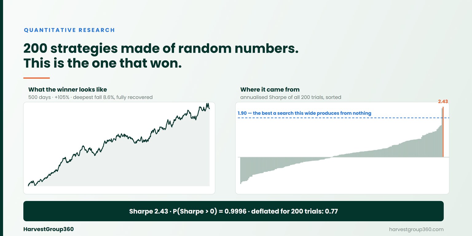
We generated two hundred trading strategies out of random numbers. Not weak strategies, not badly designed ones — sequences of returns drawn from a distribution with a mean of exactly zero, containing no information about anything. Then we picked the best. It shows an annualised Sharpe ratio of 2.43, a total return of 105% over two years, and a worst drawdown of 8.6% that it fully recovered. Every standard significance check on it passes.
This is the failure mode that survives a correct pipeline. Our previous notes covered four ways a backtest reads the future: a value used before it was observable, labels that overlap the block being tested on, a sample assembled from the instruments that survived, and figures that were quietly revised afterwards. All four are defects in the data, and all four have fixes. This one is not in the data at all. The dataset can be flawless, every calculation correct, every timestamp honest — and the number at the end is still the largest of many attempts.
The setup is deliberately trivial, so that nothing can be blamed on the construction. Two hundred independent series, five hundred daily observations each, drawn from a normal distribution with mean zero and a standard deviation of one percent. No prices, no signals, no parameters. Each series is treated as the daily return stream of a strategy, and its Sharpe ratio is computed the ordinary way: mean over standard deviation, then annualised by the square root of 252.
By construction, the true Sharpe ratio of every one of them is zero. There is nothing to find, and no procedure could find it. The only question is what the best of two hundred looks like.
The distribution of the two hundred results ran from −1.29 to 2.43 annualised, with a median of 0.13 — close to zero, as it must be. The winner:
| The selected strategy | Value |
|---|---|
| Annualised Sharpe ratio | 2.43 |
| Total return over 500 days | +105% |
| Deepest drawdown | 8.6%, fully recovered |
| Skewness | −0.14 |
| Kurtosis (non-excess) | 2.83 |
| Probability the true Sharpe is above zero | 0.9996 |
| Minimum track record length at 95% confidence | 120 days |
| Observations available | 500 |
Read that table as an analyst would. The ratio is excellent. The drawdown is shallow and it recovered. The return distribution is close to normal — no fat left tail hiding a blow-up. The probabilistic Sharpe ratio, which asks whether the sample is long enough to distinguish the result from zero, comes back at 99.96%. The minimum track record length says 120 days are needed and 500 are available, so the record is four times longer than the test requires.
A Sharpe ratio computed from one strategy is an estimate of that strategy's true ratio, and it varies around it. With 500 observations, the standard deviation of that estimate is roughly one over the square root of the sample — about 0.045 per period, or 0.71 annualised. So a strategy with no edge at all routinely produces a measured ratio somewhere between −1.4 and +1.4 annualised. That is not a flaw in the ratio; it is what estimating anything from five hundred observations looks like.
Now draw two hundred of them and keep the largest. The maximum of two hundred draws from a distribution centred on zero is not near zero — it sits out in the upper tail, and it is there deterministically rather than by luck. Run the whole experiment again with a different seed and you get a different winner with a similarly good-looking figure. The search manufactures the result.
That quantity has a name and a formula. Given a number of trials and the dispersion of their results, the expected maximum Sharpe ratio is the best figure a search of that width produces from strategies that are all worthless. It rises quickly with the first few dozen attempts and then slowly, because it scales roughly with the square root of the logarithm of the trial count.
| Configurations tried | Best annualised Sharpe expected from nothing |
|---|---|
| 1 | 0.00 |
| 10 | 1.08 |
| 50 | 1.56 |
| 200 | 1.90 |
| 1,000 | 2.23 |
| 10,000 | 2.65 |
This is the table worth keeping. A researcher who tries ten variants of an idea and reports an annualised Sharpe of 1.0 has reported something below what ten attempts produce from noise. A grid of a thousand cells needs to clear 2.2 before it has said anything. And the honest reading of our winner's 2.43 is that a search of two hundred is expected to produce 1.90, so the excess over what the procedure guarantees is 0.53 — not 2.43.
The correction, set out by David Bailey and Marcos López de Prado in 2014, is to run the same significance test against that level instead of against zero. The result is a probability: how confident can you be that this strategy is better than the best your search would have found in noise.
| Question | Answer for our winner |
|---|---|
| Is the true Sharpe above zero? | 0.9996 |
| Is it above what 200 trials produce from noise? | 0.77 |
0.77 against a conventional threshold of 0.95 is a rejection. The strategy that looked overwhelmingly significant is, once the search is accounted for, not distinguishable from the best of two hundred coin flips — which is precisely what it is.
An experiment like this invites the suspicion that the run was picked. It was not. Here is the same procedure on five seeds, the first four of which are just 1, 2, 3 and 42:
| Seed | Best annualised Sharpe | P(Sharpe > 0) | Deflated |
|---|---|---|---|
| 1 | 1.70 | 0.9915 | 0.37 |
| 2 | 2.32 | 0.9995 | 0.70 |
| 3 | 1.86 | 0.9952 | 0.48 |
| 42 | 2.05 | 0.9980 | 0.53 |
| 20260822 | 2.43 | 0.9996 | 0.77 |
The pattern is the point. Across every seed the ordinary test says the result is overwhelming and the deflated test says it is not. The seed we used for the figures above happens to be the most favourable of the five, and it still fails.
The formula is easy. Supplying it with a true trial count is not, and this is where the method usually breaks down in practice.
The number that belongs in the calculation is every configuration whose result you looked at. That includes the ones abandoned after a glance, the variants that never got written down, the earlier version of the idea from two weeks ago, and the parameters someone changed by hand before running it again. Those are what made the survivor a maximum. A count taken from the strategies that reached a report is not a trial count; it is a count of survivors, and using it defeats the correction. The same word describes a different version of the same problem one level down, in the universe the strategies were tested on: every name on today's index list is a name that survived.
The formula assumes the trials are independent. Two hundred separately generated random series satisfy that assumption exactly, which is why the demonstration above is clean. A parameter grid does not: neighbouring cells share most of their data and produce results that move together, so a grid of two hundred cells is a narrower search than two hundred independent attempts.
We tested that directly. On a moving-average crossover grid of 174 configurations run over a synthetic price path with no drift, the best configuration landed above the predicted level on some samples and well below it on others. The prediction is noisy in both directions when the independence assumption is violated, which means the trial count should be read as an effective number rather than a literal one. We report this because it limits what the figure can be used for: it is a strong argument for scepticism about a wide search, and a weak instrument for ranking two searches against each other.
Three things, none of them clever.
The trial count travels with the result. A Sharpe ratio reported without the number of configurations behind it is now treated as incomplete in the same way a measurement without units would be. Asking for a deflated figure with only half its inputs raises an error in our library rather than quietly omitting it, because the deflated number is the one that changes the conclusion and its absence should not be something you discover later.
The report says what the ratio leaves out. The object our code returns carries the figure and a list of warnings beside it: that it is per period until a calendar is stated, that observations were missing, that the sample is shorter than the minimum track record length, that no trial count was supplied. Those warnings are derivable from the other fields, and none of them survives being copied into a slide, which is exactly why they are attached to the number rather than left in a docstring.
Nothing returns a flattering placeholder. A return series that never moved has no Sharpe ratio, a sample with no losing period has no measurable downside, and a curve that never fell has no drawdown. All three return nothing rather than a zero or an infinity, because each of them is a statement about the sample being short. The related discipline on annualisation — no default factor, state your calendar — is covered in the VWAP benchmark that flatters you and in our pipeline audit.
All of this is in the open-source library, MIT-licensed and with no runtime dependencies. The distributional work is built from the standard library's error function rather than pulling in a scientific stack:
$ pip install market-data-normalizer

$ mdnorm metrics pnl.csv --column ret \
    --interval 1d --sessions-per-year 252 --session-length 1d \
    --trials 200 --trial-variance 0.00187

observations         500
Sharpe (per period)  0.153121
Sharpe (annualised)  2.43071
max drawdown         0.0861102  (peak 152 -> trough 183)
P(Sharpe > 0)        0.999621
min track record     120.016 period(s) at 0.95 confidence
deflated (200 trials) 0.769595
note: after 200 trial(s) the deflated Sharpe is 0.770; the result is not
      clearly better than the best of that many attempts on noise
Note the calendar arguments: for daily bars the session length equals the interval, so 252 sessions of one day give 252 periods a year. Passing a six-hour session with a one-day interval describes something different — a quarter of a bar per session — and returns 63, which understates the annualised ratio by exactly half. The factor has to be stated because there is no default that is right for both, which is the same argument the library makes about volatility. Omit --trials and the command says so, in the same way omitting an embargo or a staleness limit elsewhere in the toolchain produces a note rather than a silent default. The rest of the pipeline this sits on top of is documented across our engineering notes: the path from a raw feed in the market data normalization guide, alignment and features in look-ahead bias in as-of joins, and the stage-by-stage checklist in nine questions that find the errors nobody reports. Delivery is documented in the API reference. Newer in the same series: testing the selection procedure itself, which asks whether choosing the in-sample winner picks something that keeps working.
Because the correction only ever moves in one direction. Every figure in this article got worse when we measured it properly, and that is true of our own research as much as anyone's. A measurement that can only improve when you fix it was not measuring anything to begin with.
That position is the one we set out on our LinkedIn company page: the work is public, it is meant to be used by anyone, and the errors we find are in the changelog rather than quietly removed from it. A shorter treatment of the four data biases that precede this one is on Medium. The implementation is on GitHub and installable from PyPI. If you are building research infrastructure on these foundations, our partnership page is open to independent developers and firms alike.
The underlying statistics are not ours. The probabilistic Sharpe ratio comes from Bailey and López de Prado, The Sharpe Ratio Efficient Frontier (2012), and the deflated version from The Deflated Sharpe Ratio (2014). Neither is controversial and both are more than a decade old. They are missing from most research pipelines for the same reason purging and embargoes are: applying them costs you the number you wanted to report.
The probability that a strategy's true Sharpe ratio is above what a search of a given size would have produced from strategies with no edge at all. An ordinary Sharpe ratio is compared against zero; the deflated version is compared against the best result the search itself explains. It was introduced by Bailey and López de Prado in 2014, and it needs three inputs the backtest does not usually record: the number of configurations tried, the dispersion of their Sharpe ratios, and the length of the sample.
Because the reported figure stops being an estimate and becomes a maximum. Each configuration produces a Sharpe ratio that varies around its true value, and the largest of many draws sits well above the middle of that distribution even when every true value is zero. In a run of 200 strategies built entirely from random numbers, the best scored 2.43 annualised. Nothing about that number is an error; it is what a search of that width produces.
It scales with the square root of the dispersion of the trial results and roughly with the square root of the logarithm of N, so it rises quickly at first and then slowly. In our run, with 500 observations per trial, the expected best was about 1.08 annualised after 10 attempts, 1.90 after 200, and 2.65 after ten thousand. Those levels are the baseline a result has to clear, not zero.
The probability that a strategy's true Sharpe ratio exceeds a benchmark, given the sample length and the shape of the return distribution. It corrects for three things a raw ratio ignores: how many observations produced it, negative skew, and fat tails. It answers the question of whether the sample is long enough, which is separate from whether the result was selected — a strategy can pass the first test and fail the second, and in our demonstration it does.
The number of observations needed before a Sharpe ratio is statistically distinguishable from a benchmark at a stated confidence. Comparing it with the sample you have is the fastest sanity check available: a strategy whose minimum is nine years and whose backtest is eighteen months has not been demonstrated, however good the ratio looks. It grows sharply as the ratio falls, so weak edges need far longer records than people expect.
Count every configuration whose result you looked at, including the ones abandoned early, the variants discarded before they were written down, and the earlier versions of the same idea. Those are what made the survivor a maximum. Counting only the strategies that reached a report understates the search, and understating the search is exactly what the deflation is supposed to correct. In practice this means recording the count while the search is running, because it cannot be reconstructed afterwards.
Only approximately. The formula assumes independent trials, and neighbouring cells of a grid share most of their data and produce highly correlated results, so the raw cell count overstates the breadth of the search. In our own tests on a moving-average grid the best configuration landed above the predicted level on some samples and below it on others. Treating the number of trials as an effective count rather than a literal one is the honest reading.
No, and that is what makes it distinct from the other ways a backtest misleads. Look-ahead bias, overlapping labels, survivorship and revised values are all defects in the data, and each has a fix. Selection is a property of the procedure: the dataset can be flawless and every calculation correct, and the reported figure is still the largest of many attempts. The only remedy is to know how many attempts there were and to measure against that.